Brand Identity
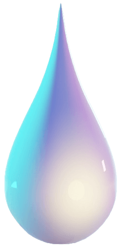
The DropletAI logo is a 3D cyan droplet — clean, minimal, and distinctly tech. It represents precision, fluidity, and intelligent systems.
Studio Name
DropletAI
One word, capital D and AI
Tagline
From Idea to Shipped Product.
Period always included
Identity
Independent AI Studio
Not “agency” or “company”
Logo Sizes
Minimum
24px
Never go below 24px
Icon
32px
Favicon, avatar contexts
Preferred
40px
Navbar, standard UI
Feature
64px
Cards, hero contexts
Display
96px
Hero, marketing
Aspect ratio: The logo is portrait (approx. 1:2.1 width:height). Always preserve this ratio — never force into a square container without padding.
What Not to Do
Do not rotate the logo at any angle
Do not stretch or distort proportions
Do not recolor or apply effects
Do not place on low-contrast backgrounds
Color System
Three brand accents — cyan, lavender, pink — each mapped to a project tier, layered over a deep navy dark background and a crisp ice-blue light background.
Brand Accents
Cyan
#7ee8fa
Primary accent
CTAs, logo mark, highlights, focused inputs
Lavender
#b8a4d8
Secondary accent
Secondary badges, card accents, Nimbus / Cmnts.io
Pink
#e8c4d4
Tertiary accent
Tertiary highlights, Vocalizer / Maanie cards
Dark Backgrounds
Deep Dark
#08091a
Primary dark bg
Page background in dark mode
Card Dark
#0d1428
Card / elevated
Cards, sidebars, nav backgrounds in dark mode
Light Backgrounds
Ice Blue
#f0f8ff
Light background
Page background in light mode
Pure White
#ffffff
Surface / card
Card backgrounds, modals, nav in light mode
Text
Text Dark
#0d1428
Body on light
Primary text on #f0f8ff or white
Text Light
#ffffff
Body on dark
Primary text on #08091a or #0d1428
Muted
#4a5568
Secondary text
Descriptions, subtitles, metadata
Brand Gradient
linear-gradient(135deg, #7ee8fa, #b8a4d8, #e8c4d4) — used for primary CTAs, the 3D droplet logo mark, gradient text, and decorative wave elements.
Accent → Project Mapping
Cyan
Pearl · Prepared911
Lavender
Cmnts.io · Nimbus
Pink
Vocalizer · Maanie
Typography
Inter is DropletAI's sole typeface. Headings are black/900 weight — heavy and sharp. Body copy is regular/400. Captions and labels are semibold with wide tracking.
Primary Font
Inter
Weights Used
Source
Google Fonts — next/font/google
From Idea to Shipped.
Independent AI Studio
What We Build
On-Device ML
DropletAI is an independent AI studio that ships production-ready AI apps, mobile products, browser extensions, and Web3 systems.
Supporting copy, card descriptions, and secondary metadata.
SWIFTUI · MACOS · FIREBASE
Gradient Text — Special Use
Shipped Product.
Reserved for key tagline words in display headings only. Achieved with background-clip: text + the brand gradient. Never used on body copy.
Spacing System
All spacing is derived from a 4px base unit. Consistent spacing creates visual rhythm and hierarchy.
Base Unit
4px
All spacing values are multiples of 4. Never use arbitrary values outside this scale.
Desktop
80px
Section vertical padding
Mobile
48px
Section vertical padding
Component Library
Core UI components built with Tailwind and Framer Motion. Every component follows the spacing, color, and type systems — light and dark mode included.
Buttons
Cards
SwiftUI · macOS · Firebase
Pearl
Real-time focus tracking with AI micro-interventions.
Project card — glass, gradient top bar
AI Apps
LLM-powered products with real-time streaming, on-device inference, and custom scoring models.
Service card — solid bg, icon tile
Featured
Glass morphism used for featured or highlighted content only — not standard listing cards.
Feature card — glass, cyan frosted border
Badges & Tags
Tech stack tags — used on project cards
Capability chips — used in section headers
Input Fields
Default state — #e2e8f0 border
Focused state — cyan #7ee8fa border + rgba tint
Iconography
We use Lucide React exclusively. Icons should be used purposefully — one icon per action or concept.
Size Scale
16px
Inline / Label
20px
UI element
24px
Feature icon
32px
Hero / Display
Common Icons
Icon Rules
- —Always use stroke-based icons — never filled variants
- —Stroke width should remain at default (2px)
- —Match icon color to surrounding text or use brand accents
- —Never mix Lucide with other icon libraries
Motion & Animation
DropletAI uses Framer Motion throughout. Motion is purposeful: scroll reveals, stagger grids, spring card hovers, and the signature droplet float pattern.
Duration Tokens
Micro
Hover states, color transitions, button feedback
Standard
Card reveals, drawer open, badge stagger
Page
Section entrances, hero fade-up on load
Decorative
Droplet float loop, gradient wave cycle — brand moments only
Easing Functions
easeOutease: 'easeOut'All entrances — element flies in and settles into place. Default for scroll-triggered reveals.
easeInOutease: 'easeInOut'Looping decorative motion (droplet float, gradient wave). Smooth and continuous.
springtype: 'spring', stiffness: 300Interactive elements — project card hover lift (whileHover y:-12 scale:1.02), drag.
Live Pattern Demos
Scroll Reveal — y:30→0, opacity 0→1, 700ms easeOut
Stagger — 120ms between children, y:50→0
Droplet Float — y:[0,8,0] loop, easeInOut, staggered delay
Named Patterns
Scroll Reveal — fade-up
opacity 0→1, y 30→0 over 700ms easeOut. viewport once, margin -100px. Used on every section header and project card.
initial={{ opacity: 0, y: 30 }}
whileInView={{ opacity: 1, y: 0 }}
viewport={{ once: true, margin: "-100px" }}
transition={{ duration: 0.7 }}
Stagger — project grid
staggerChildren: 0.12, delayChildren: 0.1 on the grid wrapper. Each card fades up with a 120ms offset.
transition={{ staggerChildren: 0.12, delayChildren: 0.1 }}
// child variant: hidden { opacity:0, y:50 } → visible { opacity:1, y:0, duration:0.65 }
Card hover — lift + scale
whileHover on project cards. y:-12 and scale:1.02 with spring. The gradient top bar and hover glow activate via CSS group-hover.
whileHover={{ y: -12, scale: 1.02 }}
// spring transition — no explicit config needed
Droplet float
Continuous y:[0,8,0] loop at 2–3.5s easeInOut, staggered by index*0.3s delay. Used in the DropletRain component and brand pattern demos.
animate={{ y: [0, 8, 0] }}
transition={{ duration: 2 + i * 0.5, ease: "easeInOut", repeat: Infinity, delay: i * 0.3 }}Grid & Layout
A 12-column grid forms the foundation of every layout. Consistent gutters and max-widths ensure content breathes.
Max Width
1280px
Content container
Columns
12
Grid columns
Gutter Desktop
32px
Between columns
Gutter Mobile
24px
Between columns
12-Column Visualized
Section Padding
Desktop (≥1024px)
80px
Vertical
32px
Horizontal
Mobile (<1024px)
48px
Vertical
24px
Horizontal
Voice & Tone
DropletAI is an independent studio that ships. Our voice is technical, direct, and grounded in real products — not consulting-speak.
Ship-First
We are builders, not consultants. Every sentence should point to something real that exists and works — not future plans or vague capabilities.
Technical
Name the stack. Say SwiftUI, ONNX, Supabase, Leaflet — not just 'cutting-edge technology'. Our audience respects specificity.
Indie & Direct
DropletAI is one studio, not a corporation. Write like a craftsperson — confident, honest, and with a point of view. No fluff.
We are NOT:
Copy Examples
From Idea to Shipped Product.
We leverage cutting-edge AI to help you realize your digital transformation journey.
A Chrome extension that strips music from any YouTube video — entirely in the browser using ONNX Runtime.
An AI-powered audio processing tool that uses machine learning to enhance your media experience.
Real-time emergency dispatch with Leaflet maps, live incident feeds, and dispatcher chat.
A powerful platform providing comprehensive emergency response solutions for modern organizations.
Tone by Context
Hero / marketing
Bold, punchy, tagline-driven. Short sentences. Heavy weight.
"From Idea to Shipped Product."
Project description
Technical and specific. Name the stack, name the feature, say what it does.
"Built with SwiftUI, Firebase, and a custom neuroscience-backed scoring model."
Contact / CTA
Direct and action-oriented. No filler words before the ask.
"Tell us about your project."
Error / feedback
Honest and brief. No over-apologizing. State the issue and the fix.
"Something went wrong. Try again."
Do's and Don'ts
A quick-reference checklist for keeping DropletAI's design and copy consistent across every product, page, and touchpoint.
Do
Use only the three brand accents — cyan #7ee8fa, lavender #b8a4d8, pink #e8c4d4 — and assign them consistently to the matching project tier
Set display and H1 headings at font-weight 900 (black). Use Inter exclusively — never substitute another font
Keep the 3D cyan droplet logo at its natural portrait aspect ratio (~1:2.1 / 240×509px). Use the full-gradient version on dark backgrounds
Build on the 12-column grid with consistent gutters. All sections use max-w-7xl with px-6 lg:px-8
Give every element room to breathe. Card padding is p-6 to p-8. Section vertical padding is py-24 to py-28
Use glass morphism (backdrop-blur-[20px] + rgba cyan border) for project cards and feature highlights only — not everywhere
Animate purposefully with Framer Motion. Use fade-up on scroll, stagger on lists, and the droplet float/rain pattern for brand moments
Name the actual tech stack in project descriptions: SwiftUI, ONNX Runtime, Supabase, Leaflet, React Native / Expo, etc.
Don't
Mix fonts from outside the Inter family — no system-ui, no Geist, no decorative fonts in the main UI
Use colors outside the palette. Do not invent new accent colors for new projects — map them to cyan, lavender, or pink
Stretch, squash, rotate, recolor, or crop the droplet logo. The aspect ratio and cyan gradient are fixed
Place readable body text over busy background images without a sufficient scrim or backdrop blur
Write vague marketing copy. Never say 'AI-powered solutions' — say what the thing is and what stack it runs on
Use animations longer than 600ms for UI interactions. Reserve 800ms+ for decorative, looping brand elements only
Ignore mobile viewports. Every component must be tested at 375px. No horizontal overflow, no oversized tap targets
Break light/dark mode — always pair text-[#0d1428] with dark:text-white, and light bg classes with their dark counterparts
DropletAI Design System · v1.0 · March 2026
For questions, reach out to the design team.